@tanstack/lit-form. Understanding these concepts will help you work effectively with forms in Lit.
Form Options
You can create reusable form options using theformOptions function. This allows you to share configuration between multiple forms:
Form Instance
A form instance represents an individual form and provides methods for managing the form state. You create a form instance using theTanStackFormController.
Creating a Form Instance
TheTanStackFormController is a Lit reactive controller that integrates with your component’s lifecycle:
this refers to your LitElement instance, which allows the controller to trigger re-renders when form state changes.
Using Form Options
You can also create a form instance using previously defined form options:Field
A field represents a single form input element. Fields are created using thefield(FieldOptions, callback) method provided by the form instance.
Creating a Field
Thefield method accepts:
- A
FieldOptionsobject with the field name and validators - A callback function that receives a
FieldApiobject and returns HTML
Field API Methods
TheFieldApi object provides methods to interact with the field:
field.handleChange(value)- Update the field’s valuefield.handleBlur()- Mark the field as blurredfield.getValue()- Get the current field valuefield.pushValue(item)- Add an item to an array fieldfield.removeValue(index)- Remove an item from an array field
Field State
Each field maintains its own state, accessible viafield.state. This includes the current value, validation status, and metadata.
Field Metadata
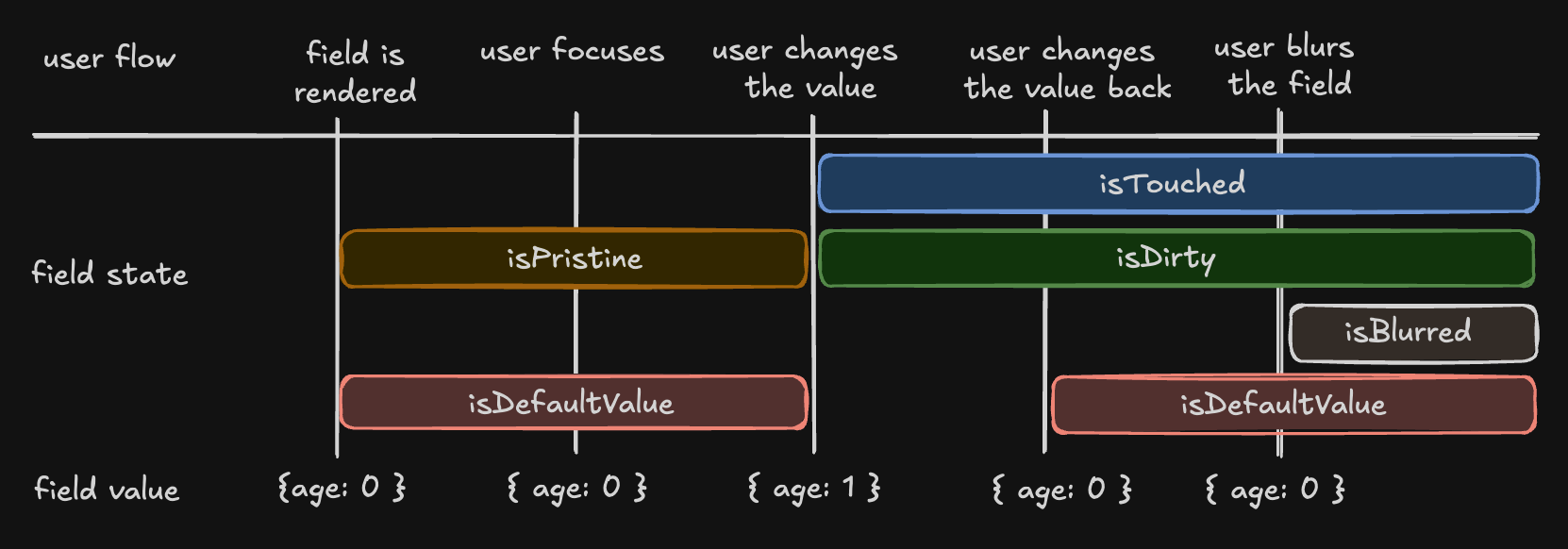
The metadata tracks user interaction with the field:isTouched- Set after the user changes or blurs the fieldisDirty- Set after the field’s value has been changed, even if reverted to default (opposite ofisPristine)isPristine- True until the user changes the field value (opposite ofisDirty)isBlurred- Set after the field has been blurred
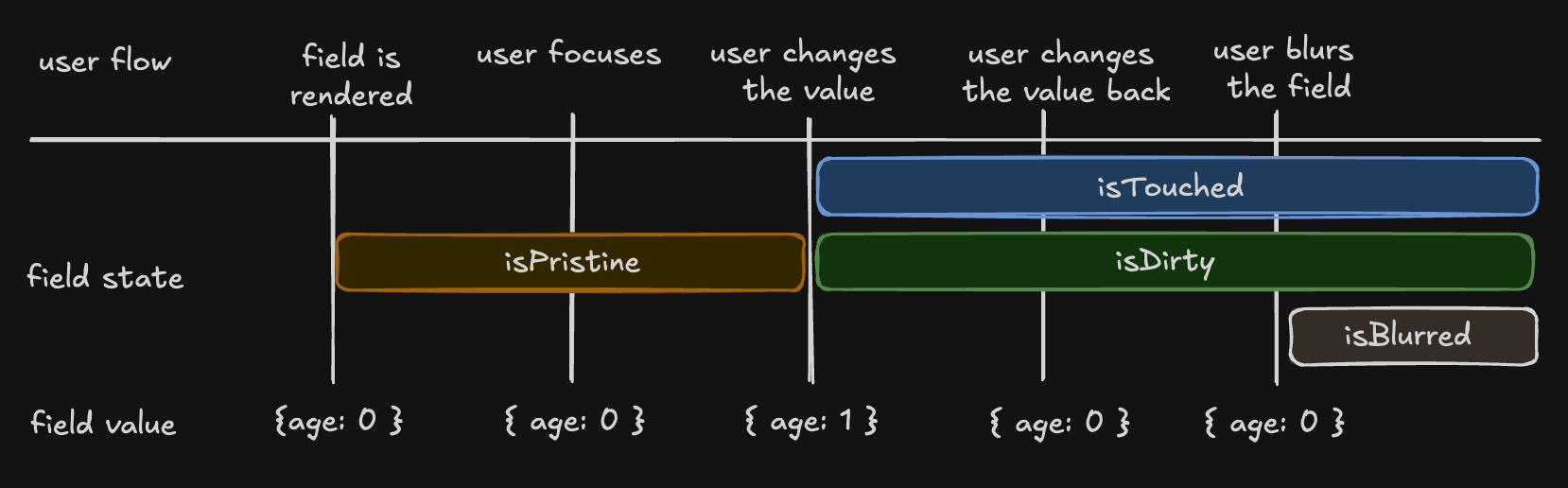
Understanding isDirty
TanStack Form uses a persistentdirty state model:
- A field becomes
isDirty: truewhen its value changes - It remains
isDirty: trueeven if you revert to the default value - This matches the behavior of Angular Forms and Vue FormKit
isDefaultValue flag:
Validation State
Field state includes validation information:errors- Array of error messages from all validatorserrorMap- Object mapping validator types (onChange,onBlur, etc.) to their specific errorsisValid- Boolean indicating if the field passes all validationsisValidating- Boolean indicating if async validation is in progress
Form State
The form instance maintains global form state accessible viathis.#form.api.state:
Conditional Submit Button
Use form state to control your submit button:Next Steps
- Learn about Form Validation techniques
- Explore Array Fields for managing lists
- Check the API Reference for detailed documentation