How we’re making Mintlify documentation more accessible
4 minutes read
Ethan Palm
Technical Writing
Share this article
Ethan Palm
Technical Writing
Share this article

Learn about recent accessibility improvements and how Mintlify helps you create documentation that works for users regardless of how they access and interact with your site.
Documentation should be usable for everyone who needs it. When someone lands on your documentation site, how they navigate and access your content shouldn’t matter. They should be able to easily find what they’re looking for and get back to building.
We’ve been shipping updates to make documentation hosted on Mintlify more accessible with improvements to keyboard navigation, screen reader support, and color contrast. We also built tooling to help you maintain accessibility as you write and update content.
Accessibility is the practice of reducing barriers so that people with disabilities can perceive, understand, navigate, and interact with your content. This includes people who are blind or have low vision, are deaf or hard of hearing, have motor disabilities that affect how they navigate the web, or have cognitive differences that affect how they process information.
Why accessibility matters
Globally, over a billion people have a permanent or temporary disability. When you reduce barriers to accessing your documentation, more people can succeed with your product.
Everyone benefits from accessibility improvements. Clearer structure, proper contrast, and keyboard navigation are valuable to all users. By improving the accessibility of your documentation, you help everyone who comes to your site or accesses your content through an AI tool find the information they need.
Tooling to catch issues early
We added accessibility testing directly into your workflow with local linting for accessibility issues.
Run mint a11y in your CLI to check color contrast and find any missing alt text. The CLI tool returns the contrast ratio of any colors set in your docs.json against WCAG 2.1 AA standards. And the tool returns the specific file and line number of any images or videos that are missing alt text.
Supporting keyboard-only users
All interactive elements are reachable with Tab, Enter, and arrow keys so that keyboard users can navigate your documentation with the same efficiency as mouse users.
Navigation is fully keyboard navigable. Nested groups, product dropdowns, language selectors, accordions–everything works with just a keyboard. Tab components now support arrow keys. This is how tabs are meant to work on the web, but our implementation needed some tweaks. Now, you can switch between tabs as expected with arrow keys. Focus indicators are visible everywhere. When you tab through a page, you can see exactly where you are. Skip-to-main-content links to bypass navigation. Jump straight to the main content on a page or navigate back to the top of a page quickly. Assistant chat controls (thumbs up/down, copy, retry) all work with keyboard navigation now.
Better screen reader support
Screen readers translate visual interfaces into speech or braille. To work well, they need proper semantic HTML and descriptive labels. Added descriptive aria-label attributes to interactive elements that needed them. Buttons and other interactive elements now tell screen readers exactly what they do Localized aria labels so descriptions are available in multiple languages. Fixed semantic HTML structure throughout components. Lists now use proper <ul> and <li> elements instead of styled divs that look like lists. These changes mean screen reader users get accurate descriptions of what's on the page and how to interact with it.
Component fixes
Some specific components needed work: Tabs: We improved color contrast to meet WCAG AA standards and added the arrow key support mentioned earlier. CodeBlock and CodeGroup: Made scrollable code regions keyboard navigable and improved contrast. Accordion components: Fixed ARIA roles and removed nested interactive controls that confused screen readers. Navigation components: Restructured to follow proper semantic HTML so screen readers announce them correctly. We also improved contrast across footer elements, API fields, tooltips, and anchor links. We thoroughly audited every component and made sure they meet WCAG 2.1 AA standards.
What this means for your documentation
If you host documentation on Mintlify, you now have:
Tooling that catches accessibility issues as you write and before you deploy. Components that work with assistive technologies like screen readers and keyboard-only navigation. Color contrast that meets WCAG standards throughout the interface. Semantic HTML structure that makes content more navigable.
You don’t have to do anything to get these improvements. They’re live for all Mintlify-hosted documentation.
Maintaining accessibility
Accessibility is an ongoing process. By building these tools and fixing core components, we’re maintaining a foundation that makes your documentation accessible to more people. As technologies and best practices change, we’ll keep shipping improvements.
To learn more about making your content accessible, see our guide on accessibility.
More blog posts to read
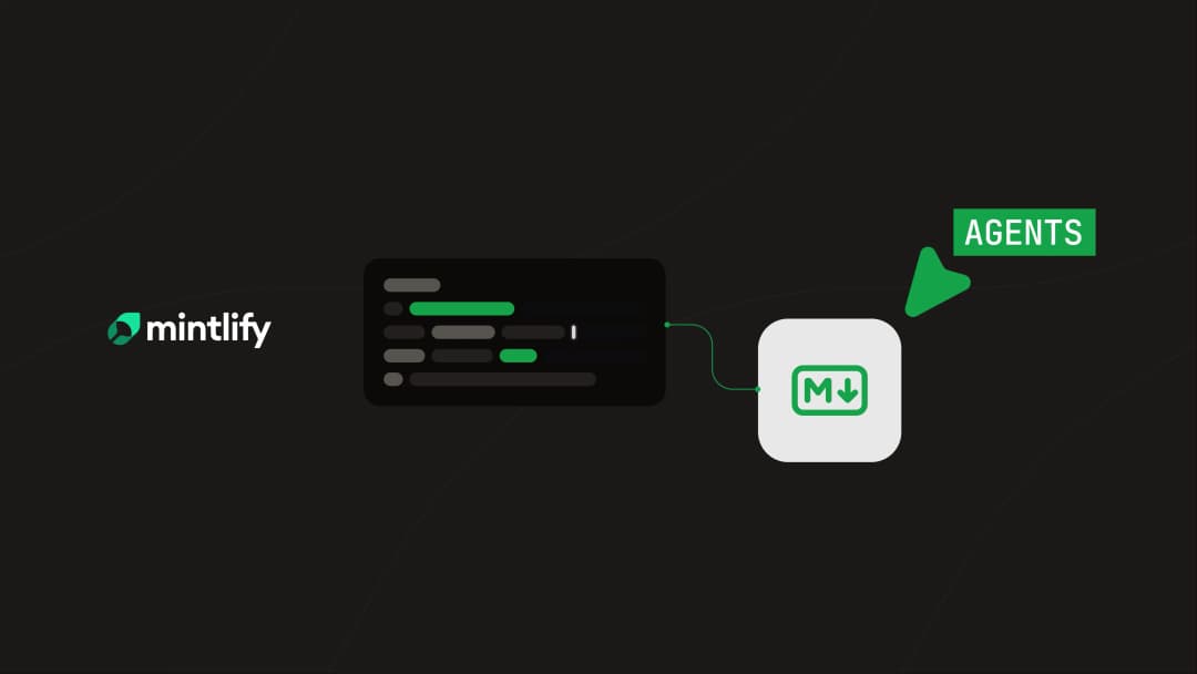
Docs as an abstraction layer for coding agents
A large engineering org ran controlled experiments to measure how structured Mintlify docs affect agent performance on massive codebases. The results: 64% more precise, 39% more discoverable, half the tokens, 1.5x faster.
June 8, 2026Han Wang
Co-Founder
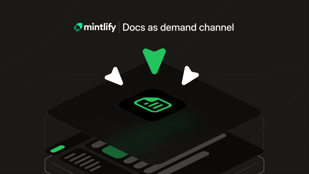
Your documentation is a demand channel
Documentation is often the highest-traffic, highest-intent surface in your entire funnel. It's the first place a buyer visits before trying your product. It's where agents surface and push your product to prospects.
June 4, 2026Lauren Volpi
Marketing