Fay Dakrouri
Design
Share this article
Fay Dakrouri
Design
Share this article
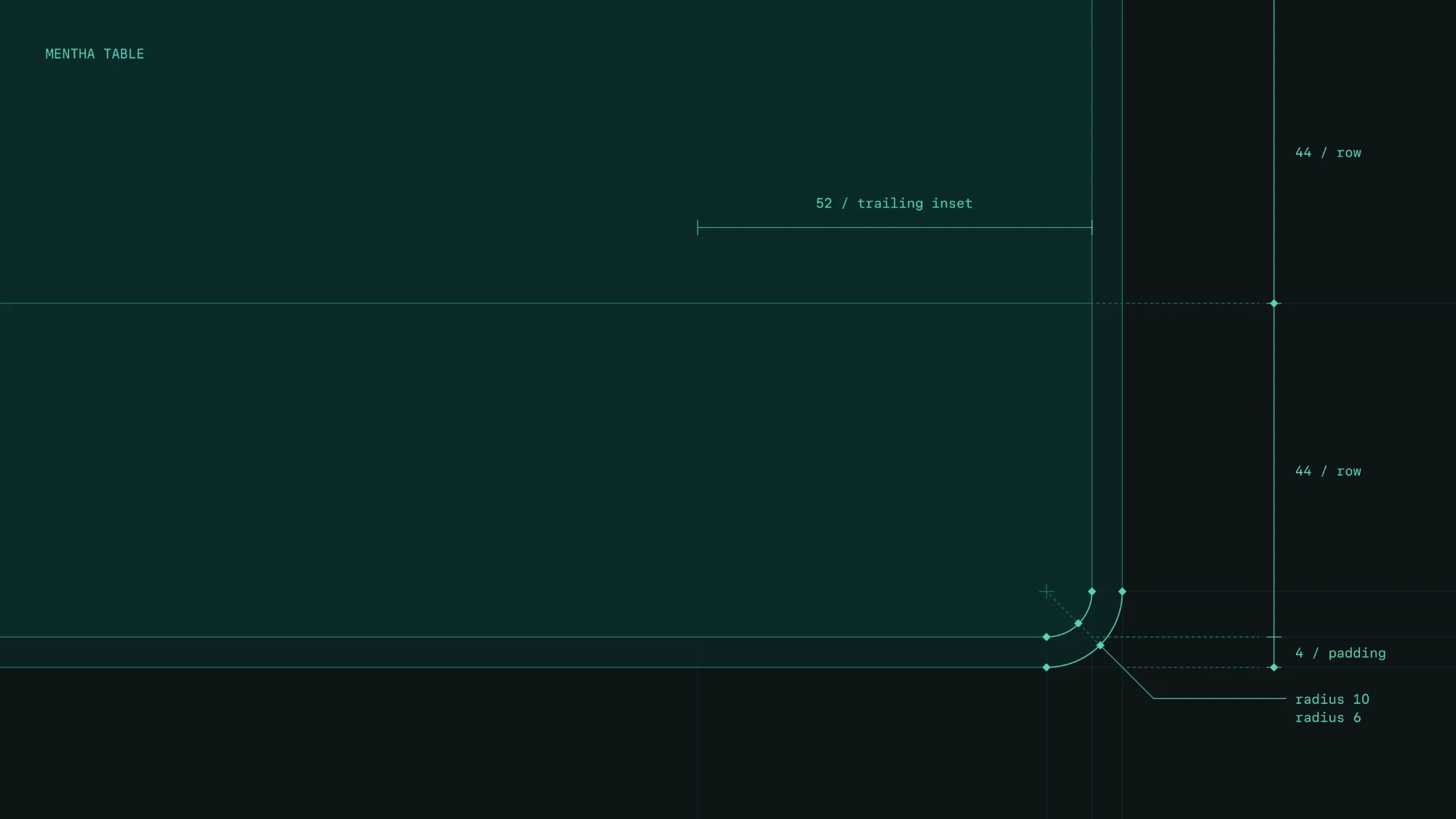
Everyone at Mintlify builds with agents now. We built Mentha (Latin for mint, and our new design system) to make sure everyone has a good starting point.
We built it on deliberate decisions, our own sense of what good design is, and baked our design judgment into its components.
Design and design engineering still have to make final calls, but having the system means fewer of them get made from scratch. Design judgment is now basically in the room even when we aren't.
Here are the choices we made, and why.
Constraints as freedom
The old system had too many variants, so every extra option became a decision someone had to make and might make differently. Inconsistency came from (funny enough) lots of reasonable decisions. In one instance you pick the 20px icon, in another you pick 16px or 14px, and both look fine on their own. But put the screens side by side and the big picture feels stitched together.
We cut size and variant options down to what we actually need. Nothing is added before there's a true, repeating use case for it. Otherwise it's not a component, it's an override. I started by designing the interface itself before turning anything into components. That gave me the freedom to explore the patterns that would later become our guiding constraints.
Baked-in decisions and patterns
We designed patterns for things that come up again and again. They help us as designers think and work within constraints. I enjoy blank canvases, but they are time consuming. If a problem is not new, we start from what already works and spend our energy on what's actually new. If a problem is new, we design it carefully and add it to the system.
Something our team is learning is that patterns help agents too. If an established pattern already answers the questions, the agent doesn't make decisions for us, so there's less to guess and less to get wrong. Patterns also help users learn something once. It works the same way everywhere, which makes the product familiar.
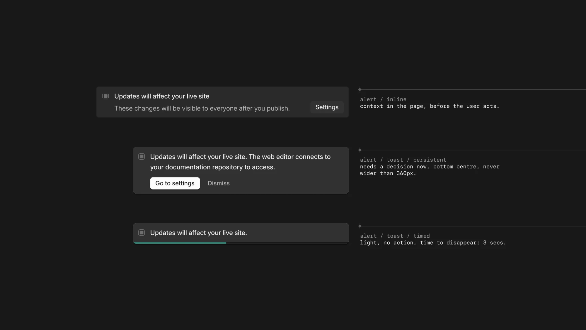
We've also included interaction rules as part of the system. For example, hover is for showing interactivity, not functionality, so we don't use hover to reveal actions. Those are much harder to find on touch screens and for keyboard users. For the sake of accessibility, nothing hides behind hover or disappears with a button in it. It's an easy pattern to get wrong, so we avoid it. Similarly, we now only use the pointer cursor on links. Not taking questions, we'll die on this hill.
Expanding the brand palette without compromising recognition
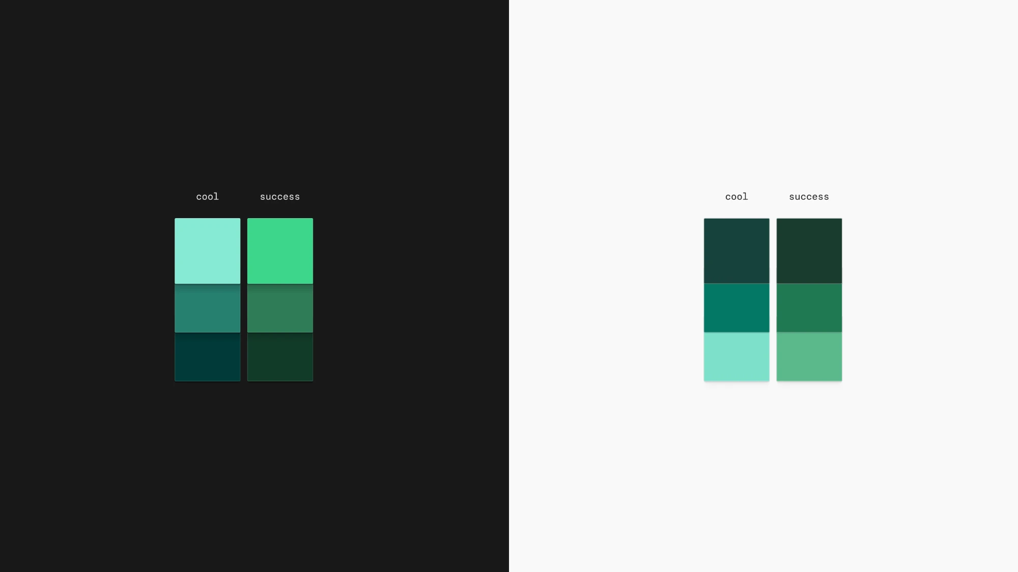
The previous color scales used brand green for things like link hovers, which ended up looking like a success state because it sat too close to a true green.
We made a slight (but brave) change and added cooler mint tones to our brand green palette, giving us a wider range of cooler greens to use in product.
Brand assets still use the whole palette, with the original greens and the new cooler shades. In product, anything brand uses only cool shades so it doesn't get mistaken for a success state.
Shadows
Previously we used no shadows. Our founder, Han Wang, has had opinions against them, and it has been quite the battle, but for the sake of adding depth where needed, we have finally reached shadow harmony.
We've added four shadow levels, and they get stronger based on where an element sits. Something resting on the page gets a lighter shadow than something floating above it. Shadows aren't always on the outside either. Sometimes they sit on an inner component instead of the usual outer box shadow.
Built with agents in mind
Agents are part of how we build now. Agents build fast, with the tradeoff that they don't create anything novel or nuanced. They try to reach the fastest conclusion in the most generic way possible. Humans don't work the same way. They have sound judgment and a sense of craft, and those are the things we need to keep the product's soul.
What we've noticed is that the more instructions, skills, and component-embedded constraints we feed an agent, the more accurate its first direction is. It's still by no means ready for production, but it's a better start than default agent output with no constraints at all.
Our decisions can be baked into the system and its components, but someone still has to know what problem we're solving, judge whether the result solves it with taste, and keep iterating based on user feedback.
What's next
A design system is always growing and evolving, so Mentha isn't finished, and it won't ever really be. It's live in the dashboard now, and next, we're bringing it to the docs you publish as components. Check it out for yourself.
More blog posts to read
Mintlify Pro for Startups and Open Source Projects
Current YC companies get 12 months of Mintlify Pro free. YC alumni and eligible startups get 50% off Pro for 12 months. Non-commercial open source projects get Pro free forever.
October 6, 2026Harkirat Chahal
Growth
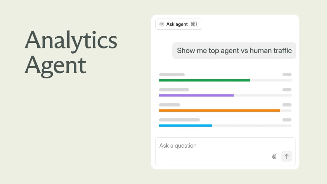
Explore your analytics with the Mintlify agent
The Mintlify agent can now answer analytics questions about your docs, so you can understand user and agent trends without leaving the editor.
September 29, 2026David Isquick
Product Marketing