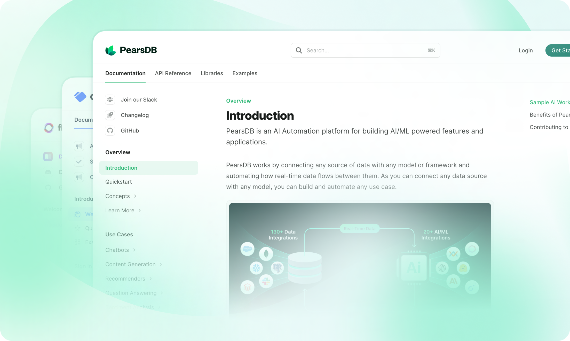
Update component to display changelog entries, version updates, and release notes with consistent formatting.
v0.1.1
How to use
Update example
Update components to create changelogs.
Update components automatically generate RSS feed entries. The entries contain pure Markdown only—components, code blocks, inline code, and raw HTML elements are not included.
If your update includes components or HTML, use the rss prop to provide alternative text for RSS subscribers.
Custom RSS content
Props
string
required
Label for the update. Appears to the left of the update and creates an anchor link using the same automatic anchor ID rules as headings. Use unique labels to create distinct anchor links.
string[]
Tags for the update. Shown as filters in the right side panel.
string
Description of the update. Appears below the label and tag.
object
Update components automatically generate RSS feed entries. Use the
rss property to create a single RSS feed entry with a custom title and description.If not provided:- Updates with Markdown headings create a separate RSS feed entry for each heading.
- Updates without Markdown headings create a single RSS feed entry using the
labelas the title.